
Coisa de Motos
A motorcycle community, turned into a brand and a store
My role
- E-commerce development and design
- Brand identity
- Content and motion
Description
Coisa de Motos sells motorcycle gear, apparel and parts online, to a community that started around a YouTube channel in 2020. We built the store on Shopify, and I designed it along with the brand and the content that brings people to it.
Team
 Daniel CritchiCEO and co-founder
 Danilo ParmegianiCo-founder
 Pedro CritchiCo-founder
Context
The channel already had an audience of riders, the motonautas, but no identity that could carry a store. The brand had to work everywhere a rider looks: a helmet sticker, a cap, a YouTube thumbnail, a story, and the header of an e-commerce site with hundreds of parts. A few months after launch we closed it: each partner wanted to take the company somewhere different, and we all had other opportunities in our careers.
Tools
- Shopify
- Illustrator
- Photoshop
- After Effects
Deliverables
- Shopify store
- Mobile shopping
- Promotions
- Blog
- Identity
- Mascot
- Ads and thumbnails
Timeline
- 2025
Hover the seal
Two films tell the store's story: what makes it a store that gets riders, and where it came from and where it's going. Press play.
Challenge
A channel has fans. A store needs a brand they trust with their money.
Coisa de Motos was a name, a voice and a community before it was anything you could buy. Turning it into a store meant keeping that voice, loud, funny and very much from the road, while looking serious enough for someone to buy a R$2,000 jacket from it.
It also had to stretch. The same identity would sit on merch, on a site full of brake discs and visors, and on a weekly rhythm of stories and thumbnails, made fast and always recognisable.
E-commerce
Built on Shopify
We built the whole store on Shopify and used as much of the platform as we could instead of building around it: a theme customised to the brand, the catalogue with its collections and variants, search and filters, checkout and payments, discount codes like MOTONAUTA, the blog, and apps for the rest.
Leaning on the platform kept a two-person team selling hundreds of parts without running servers, and left our time for what makes the store different: how it looks, how it's organised and what it says.
Theme
Customised to the brand: header, menus, product cards, banners
Catalogue
Collections, variants and stock for gear, apparel and parts
Search and filters
By availability, price and category
Checkout
Shopify's checkout and payments, in reais
Discounts
First-purchase coupons and timed offers
Blog
Articles from the channel's videos, on the store's own domain
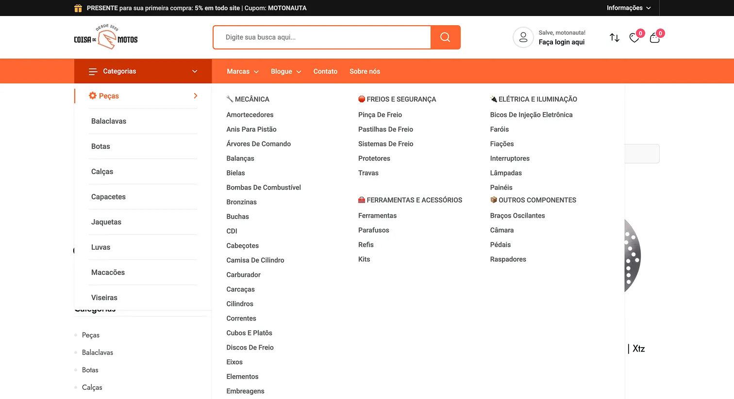
The store sells riding gear, apparel and hundreds of parts, so the design work was mostly about finding things. A big search bar sits in the header, and a mega menu splits parts by system: mechanics, brakes, electrics and the rest.
A storefront that sells
The home page opens on the week's offer, then the categories riders shop most: helmets, jackets, gloves, boots and parts. A thin bar on top gives every first-time buyer 5% off with the coupon MOTONAUTA, in the community's own word, and the account greets them with “Salve, motonauta!”.

Parts, by system
Categories open into a mega menu grouped the way a mechanic thinks, so someone looking for brake pads never scrolls past exhausts.
Built for the phone
Riders find the store through Instagram and YouTube, on their phones, so every screen was designed for the phone as much as for the desktop. We also turned the path into a six-step guide on how to buy, from the home page to checkout, for the people who had never bought gear online.
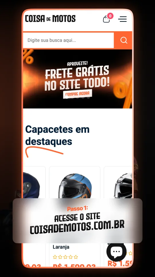
1 · Open the site
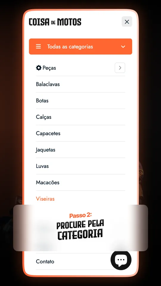
2 · Pick a category
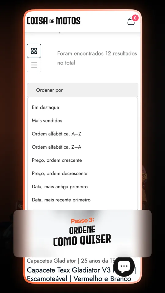
3 · Sort what you see
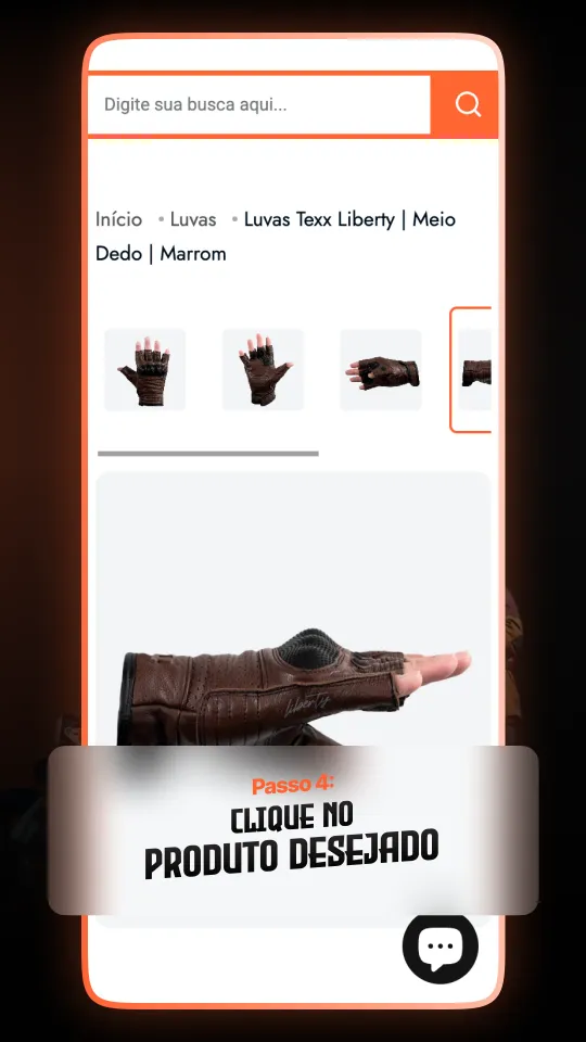
4 · Open the product
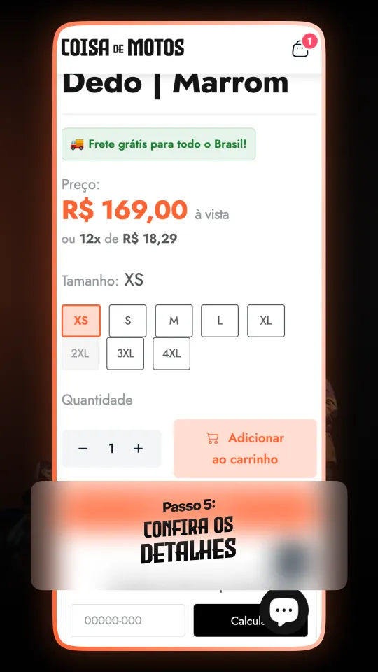
5 · Check the details
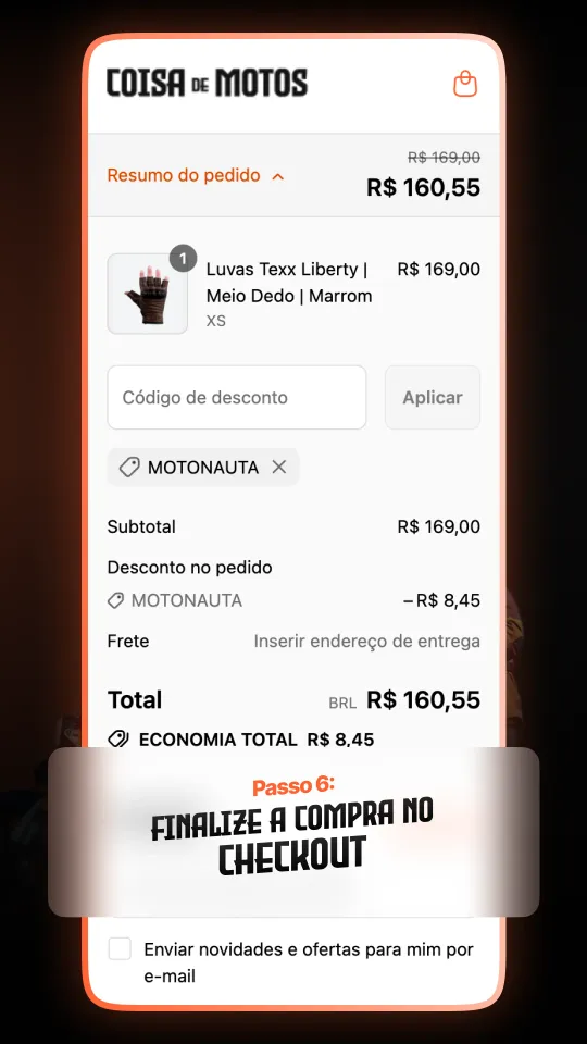
6 · Check out
Promotions in the brand's voice
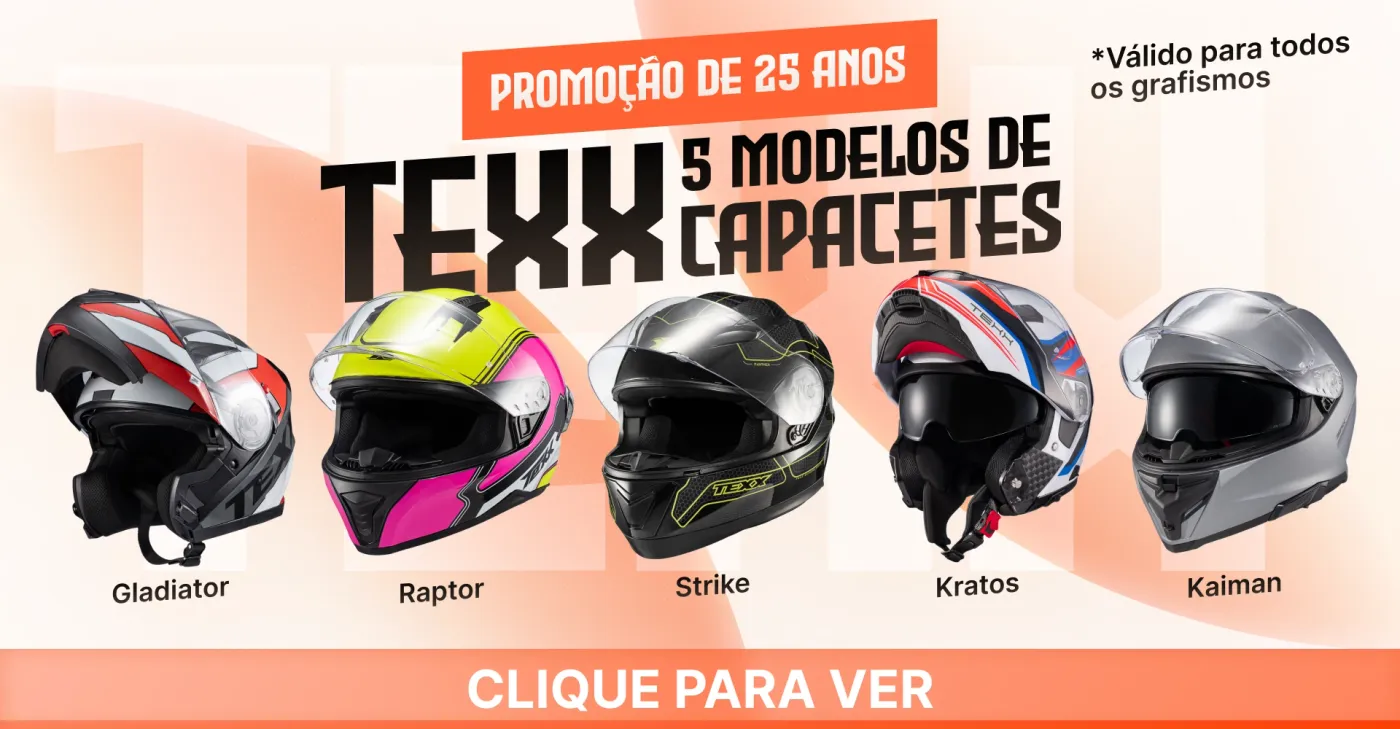
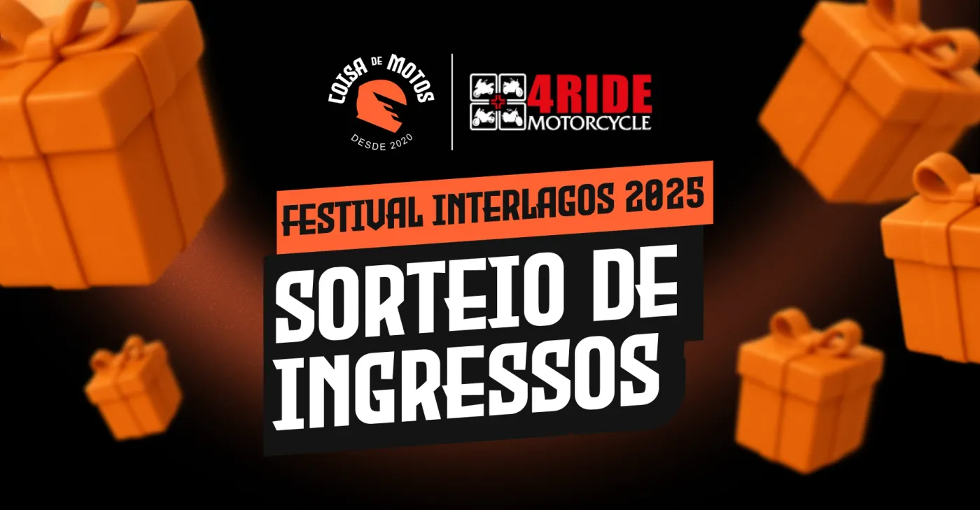
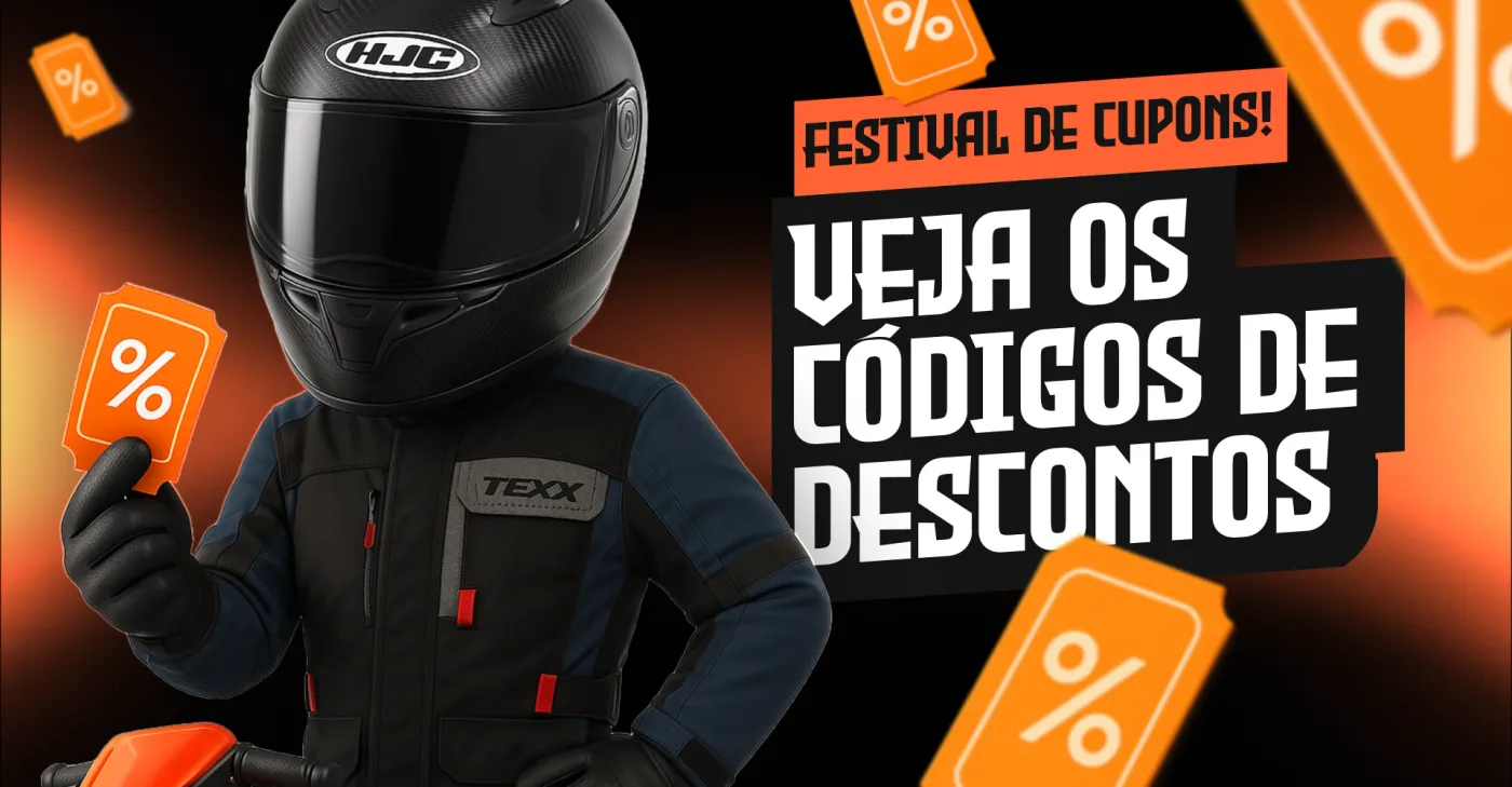
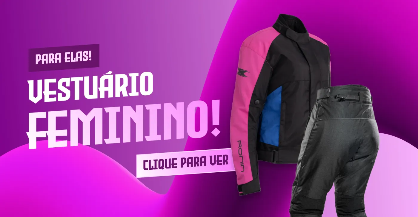
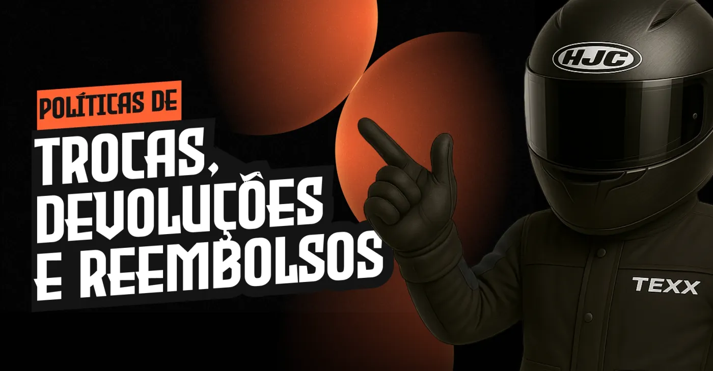
Every campaign on the site gets its own banner in the same system: free shipping on everything, Texx's 25th anniversary on five helmet models, a ticket giveaway for Festival Interlagos 2025 with 4Ride Motorcycle, coupon codes, a women's apparel line and the returns policy.
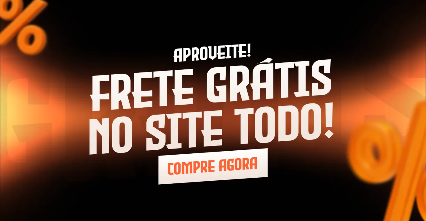
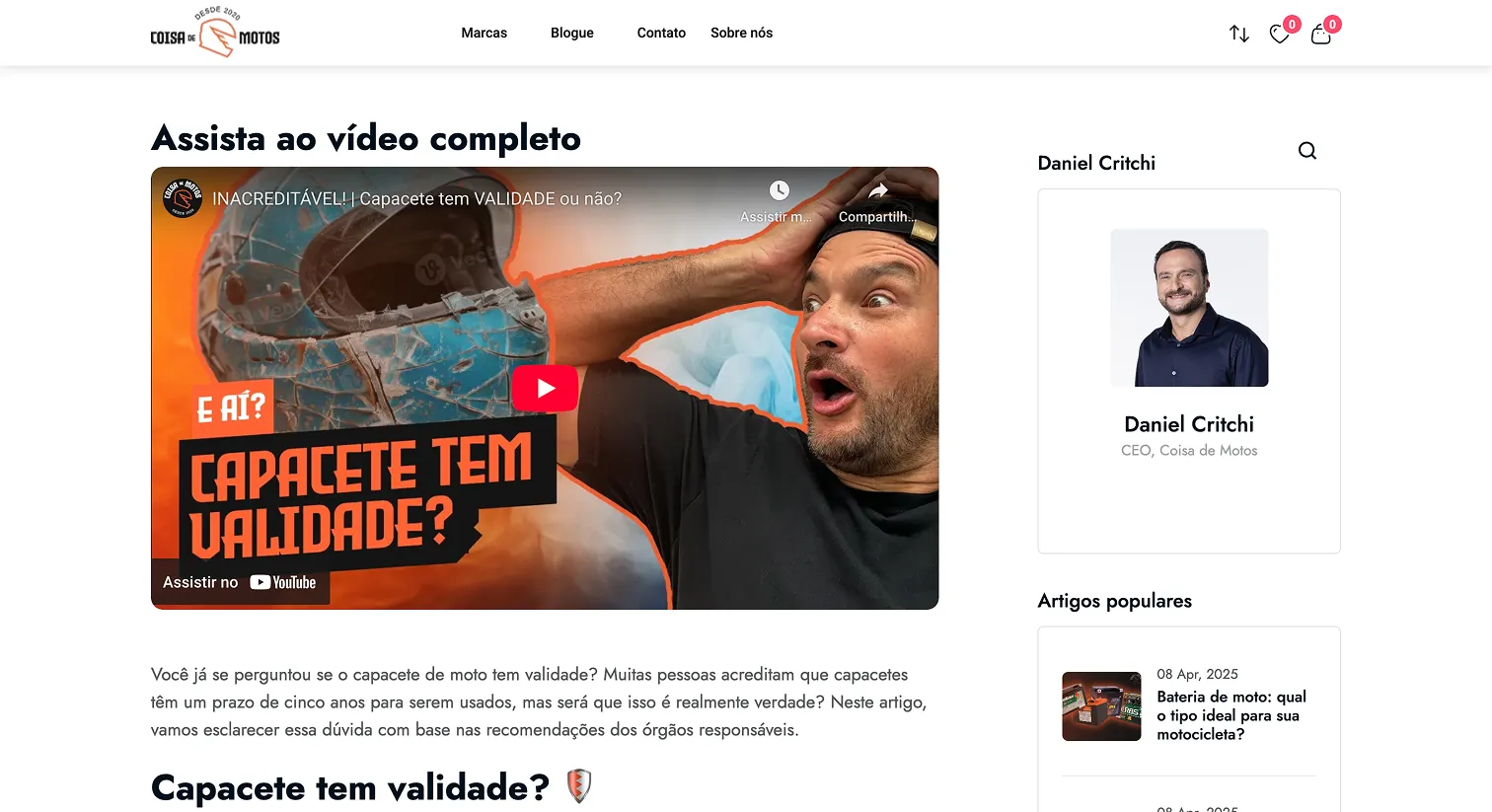
Content that brings people in
The blog turns the channel's videos into articles, “does a helmet expire?”, so search and YouTube both lead back to the store.
Brand
The symbol
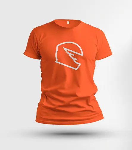
The symbol is a helmet seen from the side, its visor cut into three strokes that read as speed, and as the letter E of a rider in motion. It works filled for small sizes and stamps, and outlined for large, airy ones, in orange, black or white.



The wordmark
The wordmark and every headline are set in Evil Empire, a heavy condensed display face with a garage-sign feel, with a small “de” tucked between COISA and MOTOS. Riders shorten the name to those two big words anyway. On the store, the interface runs on Inter, so prices and sizes stay easy to read under the loud headlines.

A seal built on circles
The seal is built on circles around one centre: the letters ride a band between R, the outer radius, and 0.75R; “desde 2020” sits on its own smaller arc below; and the helmet, a little over R tall, sits slightly right of centre so the visor points forward, the way a rider leans into a turn.
The round seal on its construction. R is the outer edge of the letters; the lattice is R/10.
Lockups
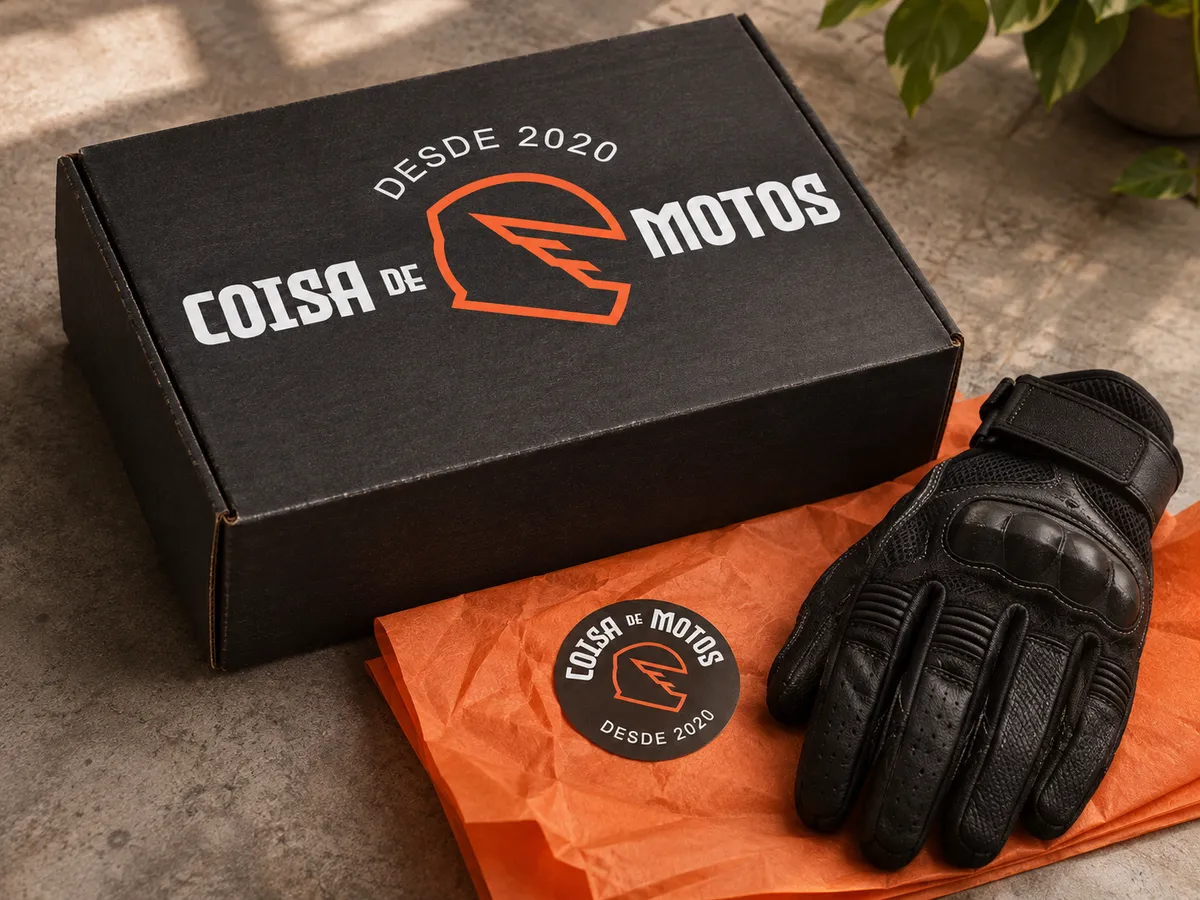
The pieces combine into four lockups: horizontal for headers, vertical and a second vertical for square spaces, and a round seal, with “desde 2020” on its arc, that works as a profile picture, a sticker and a patch. Each one has a YouTube version for the channel.
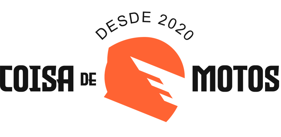
Horizontal
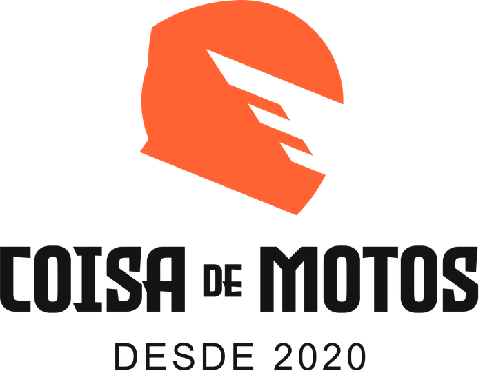
Vertical
Round seal
Colour
One loud colour and a few quiet ones, all saved as styles in the Figma file. Laranja is the brand: it's the symbol, the buttons, the sale bars. Near-black and white carry everything else, so the orange always means something.
Motonauta, the mascot
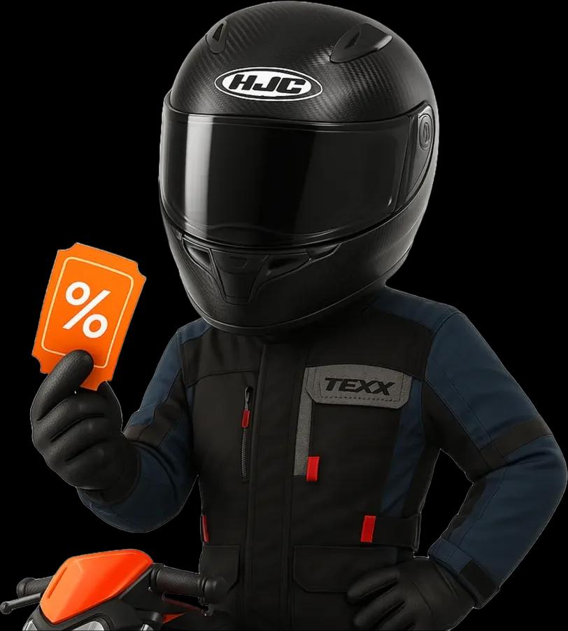
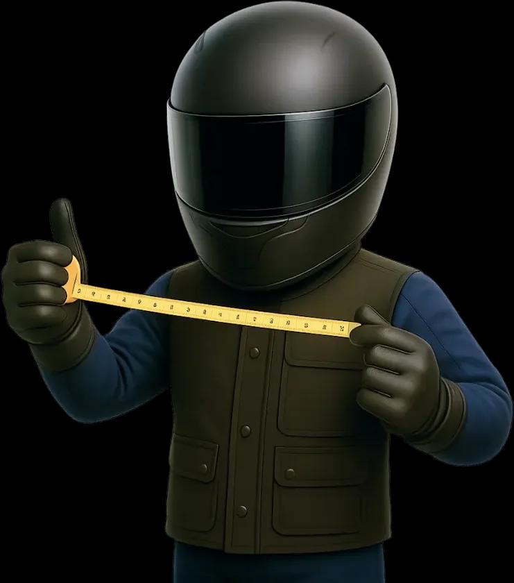
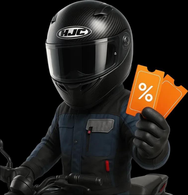
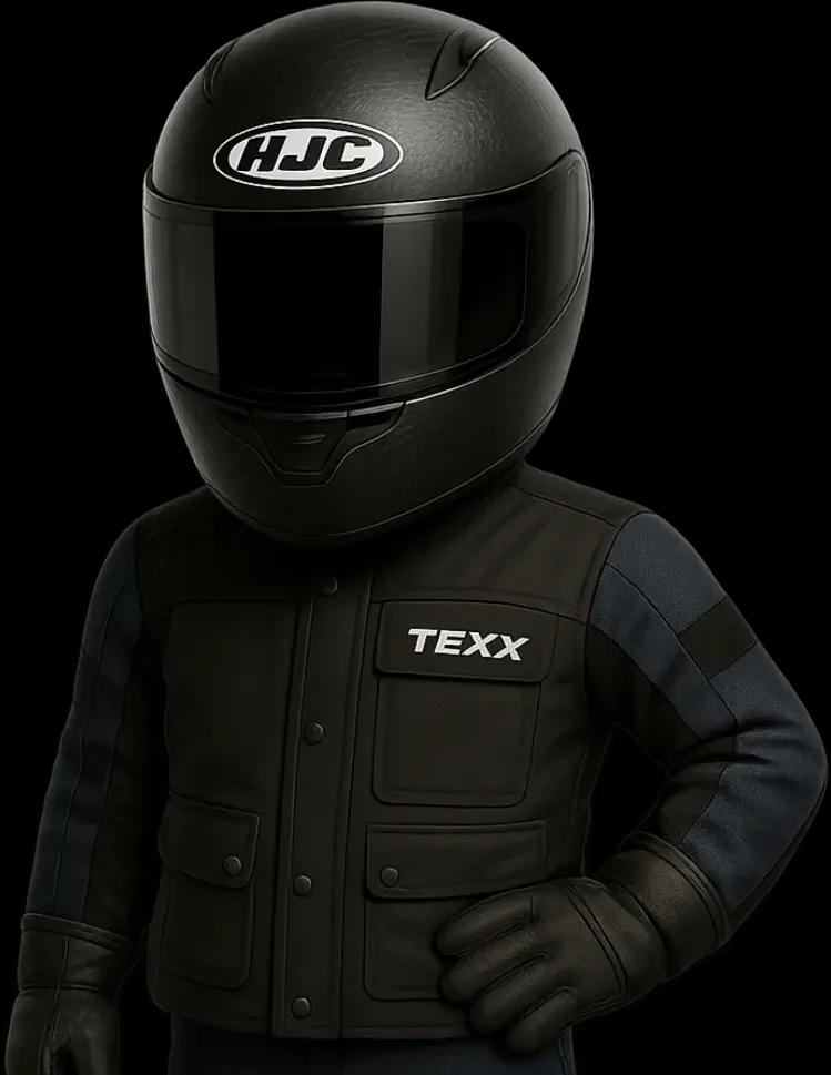
The brand needed a face that wasn't a person, so it got Motonauta: a rider in a black helmet and a Texx jacket who stands in for the community. He holds the coupons, gives the thumbs up, measures his head for a helmet size. The poses were generated with AI image tools and curated into one consistent character.

3D offer icons
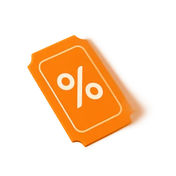
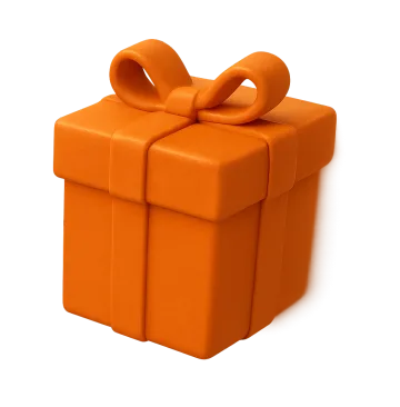
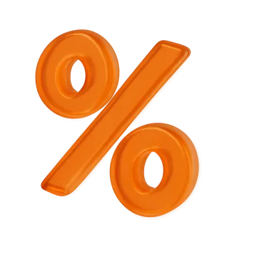
For offers there's a set of 3D objects in the brand's orange: coupons, percentages, gifts, balloons in orange and black, a question mark, a cart, a camera and a star. They float around the products in banners and ads. Shove them, or pull one back and let it go.


On people
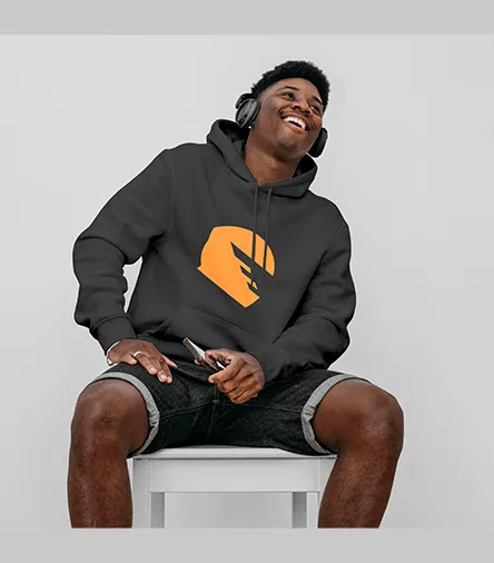
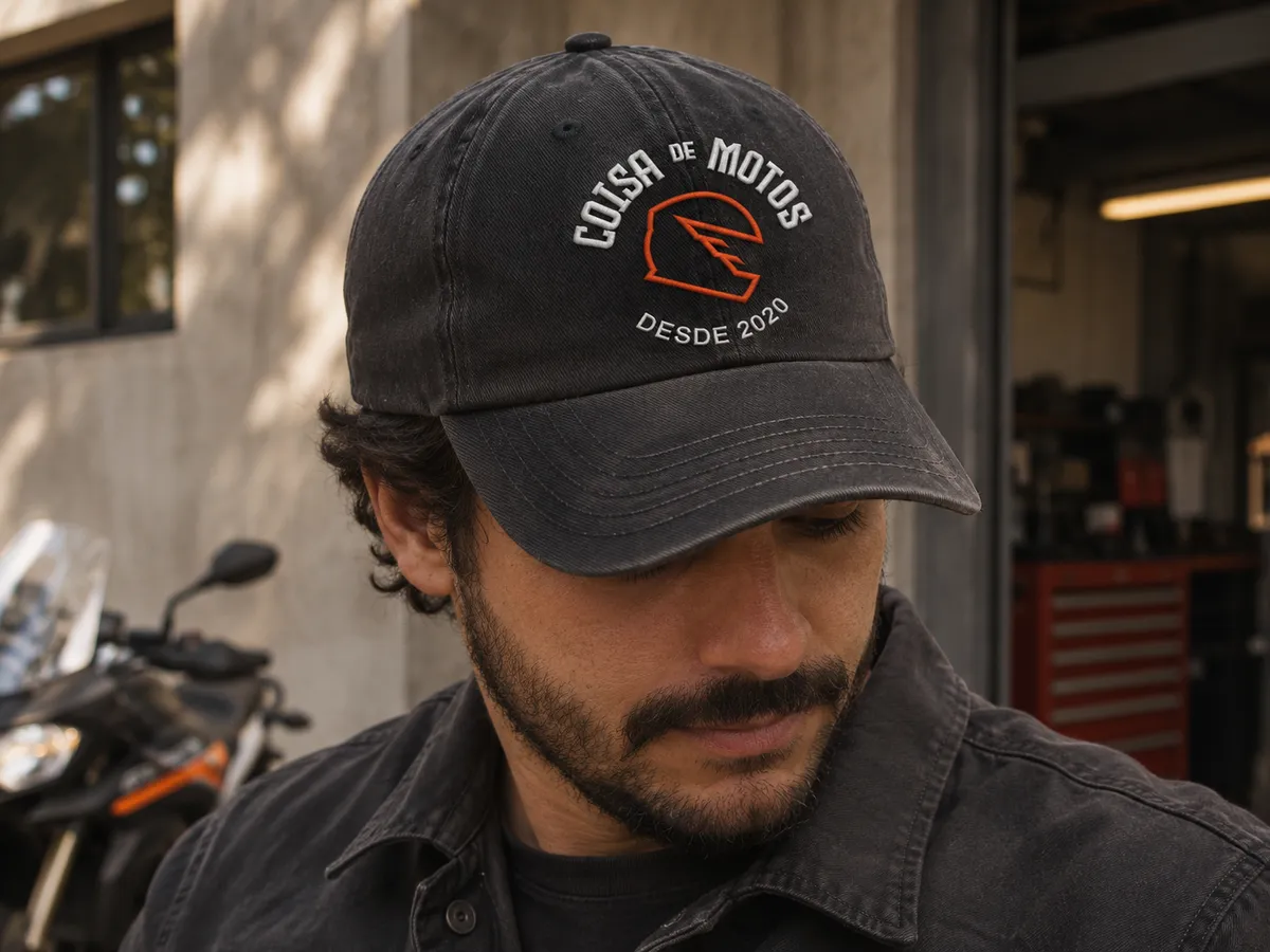
The first place the brand had to work was on people. The symbol sits small on the chest and big on the back, and the round seal carries over to a cap and to the box an order ships in.
Content
A store this size lives on a steady rhythm of posts, so the brand needed templates more than one-offs: one look per series, quick to fill in and impossible to mistake for anyone else.
The launch
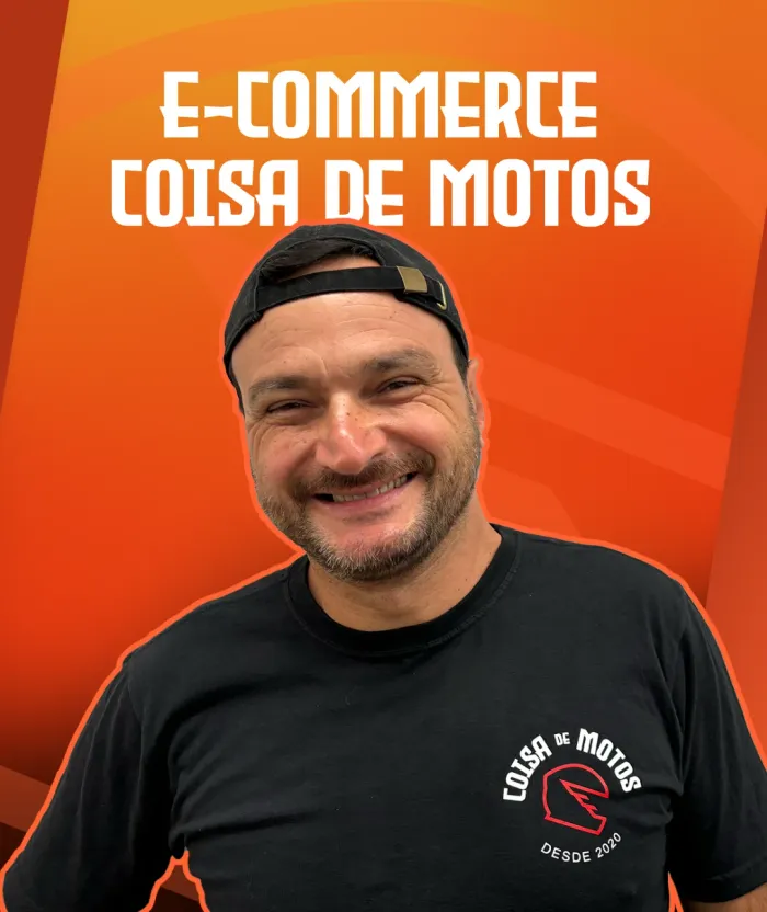
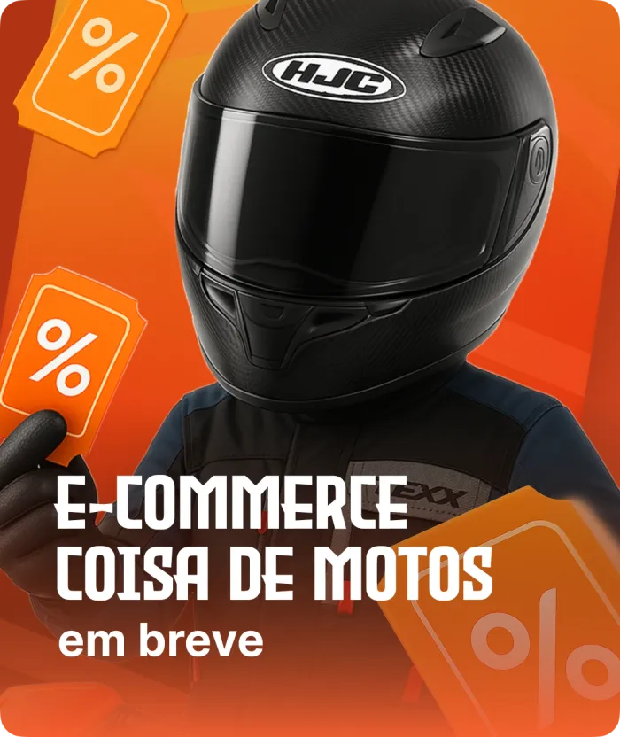
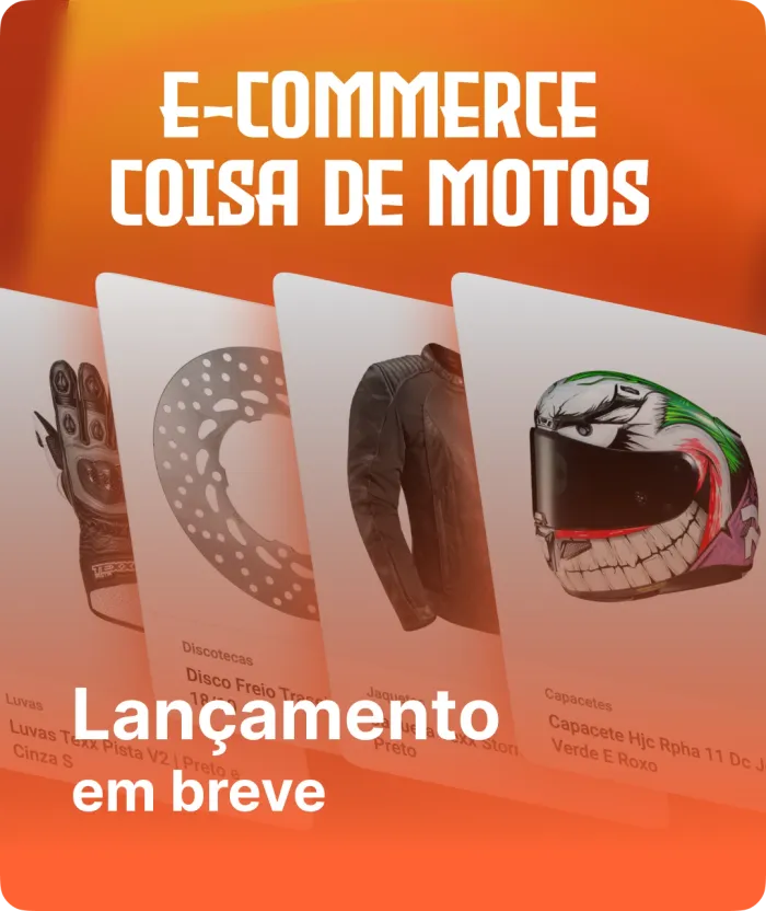
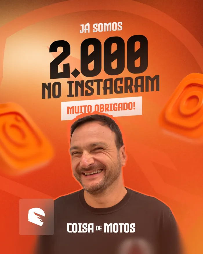
The store opened with a teaser series, “E-commerce Coisa de Motos, lançamento em breve”: the products, Motonauta and Daniel himself, one post at a time, until the site went live. Months later the same system celebrated 2,000 followers on Instagram.

Coisa de Motos
Maior e-commerce para motos do Brasil! 🏍️
Encontre tudo o que sua moto precisa.
coisademotos.com.br
 Sobre nós
 Medidas
 FAQ
 Vídeos
 Loja
 Clientes
 Ofertas
 Cupons
 Como comprar
 Moto criadores
 Mototrips
 Manutenções
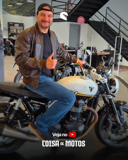
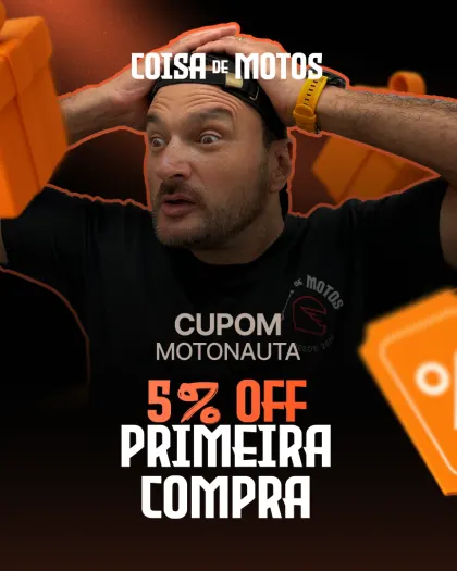
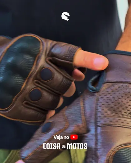
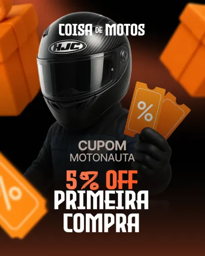
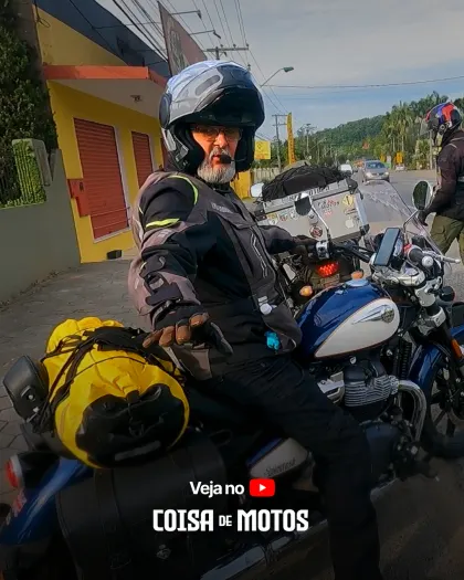
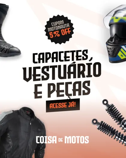
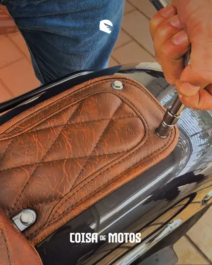
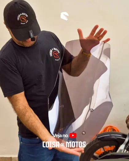
Instagram is the store's shop window, so the profile was designed as a whole, not post by post. The avatar is the round seal, and the highlights work like a menu: twelve covers, an orange icon on asphalt each, for sizes, FAQ, videos, the store, customers, offers, coupons, how to buy, the creators, trips and maintenance, with “Sobre nós” in full orange first.
The feed mixes three kinds of posts, each with its own template: product posts filmed with the gear itself, with a small “watch it on YouTube” tag, offers on the orange or black grounds of the ads, and moments like the 2,000-follower thank-you. Reels get covers in the same type, so the grid reads as one brand from a distance.
Product posts
Real hands on real gear, tagged to the full video
Offers
Coupons and launches on the ads' grounds
Reel covers
Big Evil Empire type over the frame
Highlights
A menu of covers: one orange icon on asphalt each
Ads
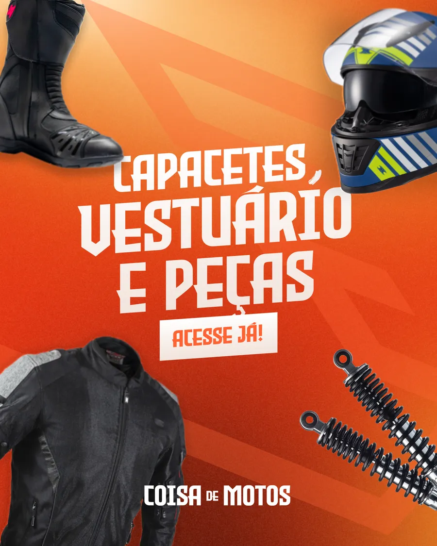
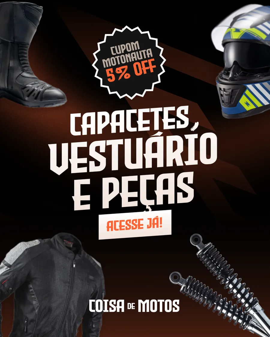
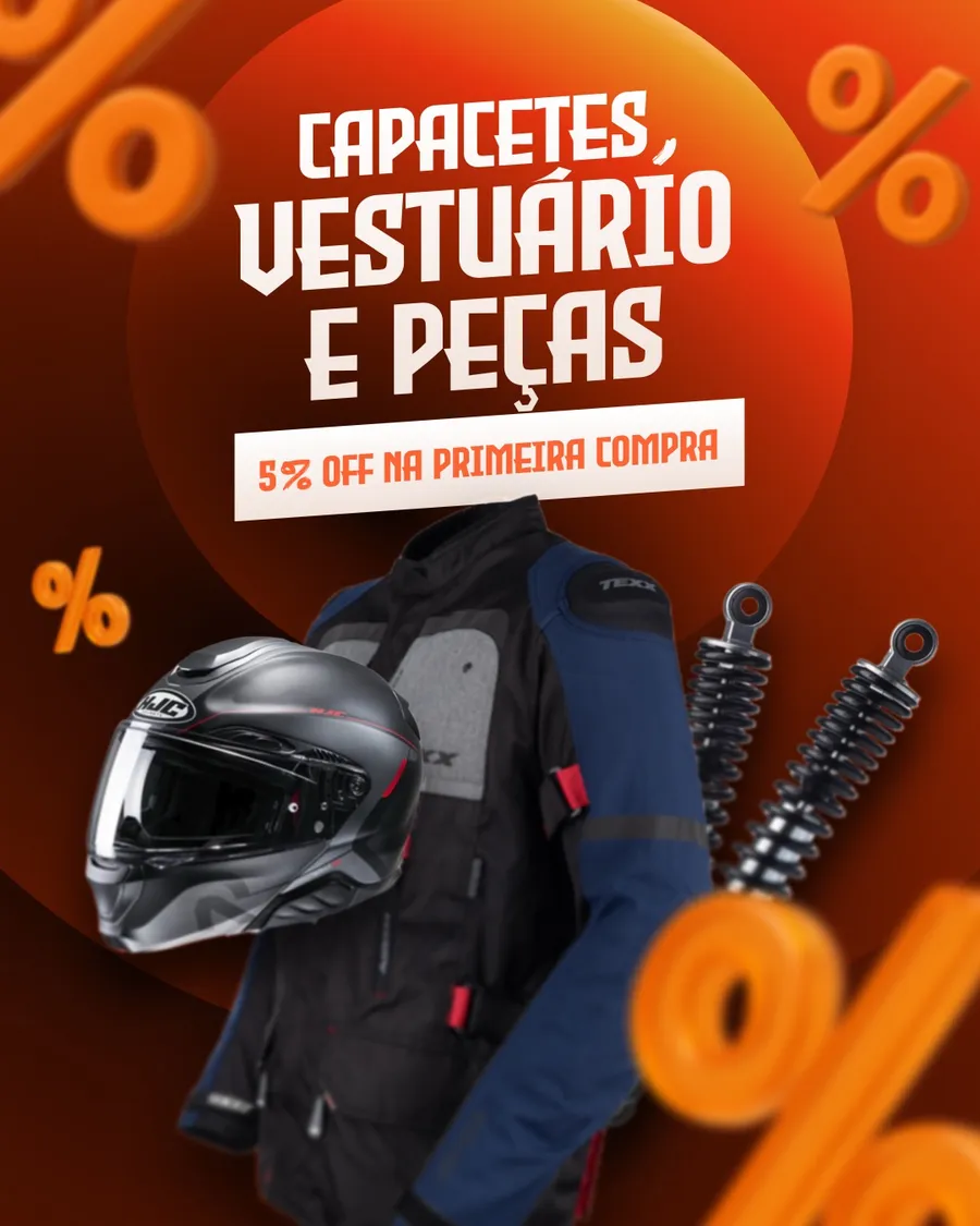
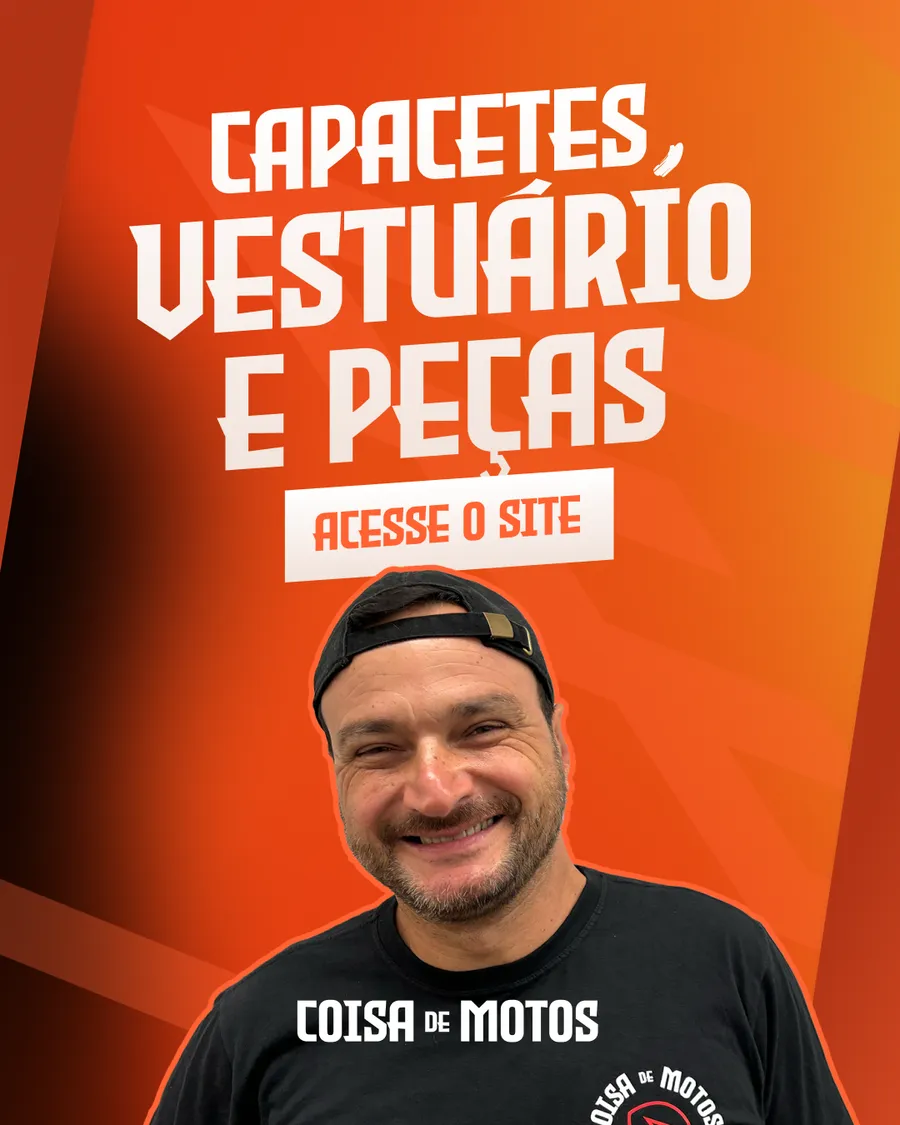
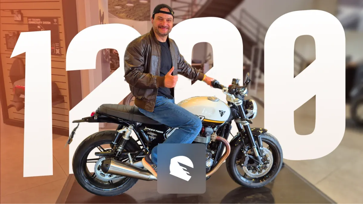
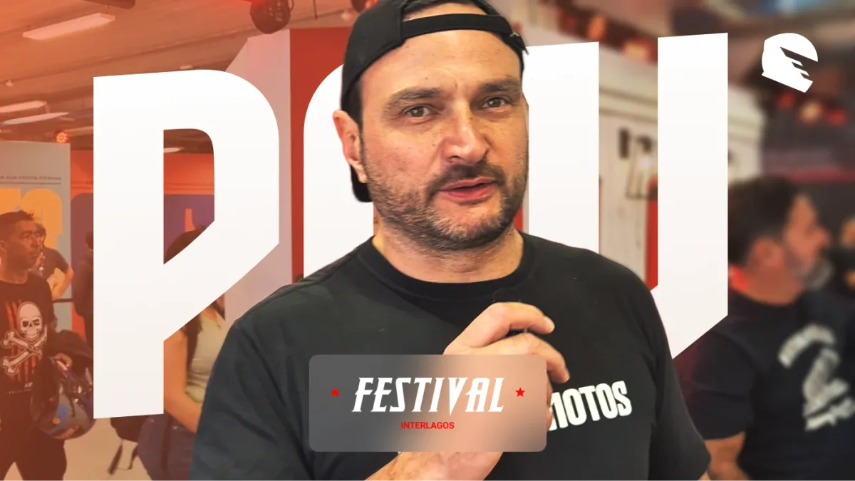
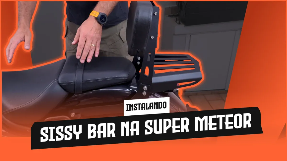
Ads and thumbnails push the brand further: the orange becomes a whole background, the products float in 3D around the person, and the type gets as big as the frame allows.
YouTube
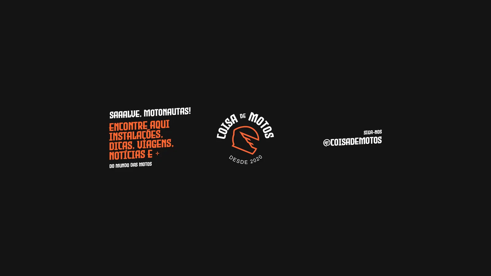
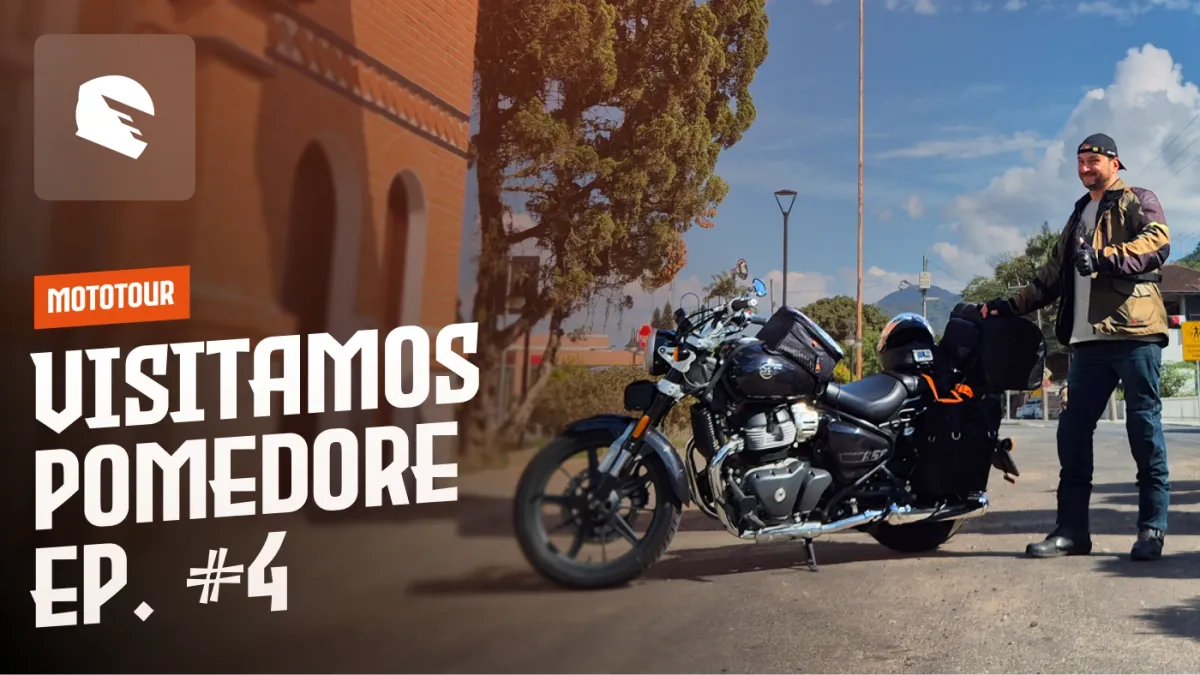
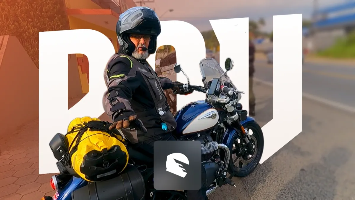
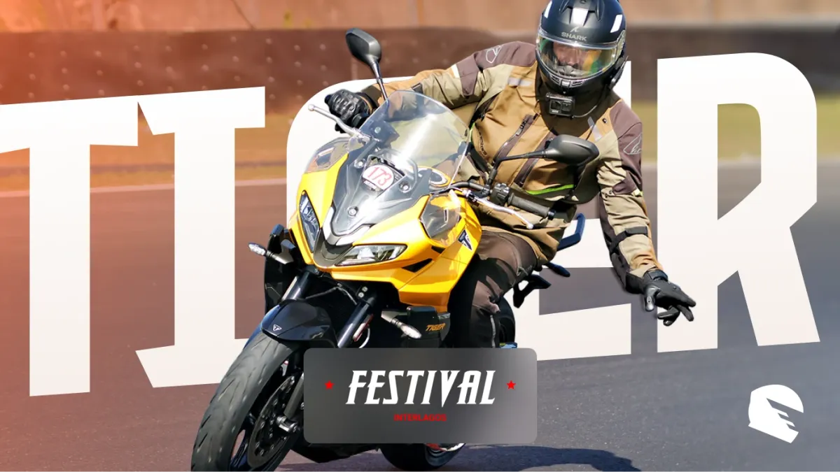
On YouTube the channel keeps the same system: a banner with the seal, and over three hundred thumbnails with the same heavy type and orange bars, for trips, reviews, installs and questions from the community.


Takeaways
Knowing when to stop
We closed Coisa de Motos a few months after the store went live. Each of us wanted to take the company in a different direction, and each of us had other opportunities in our careers, so we stopped rather than pull it three ways. The brand, the store and everything we made for it are what's left, and what this page is about.
A community is a brief
The best decisions came from the riders themselves: their word for themselves, motonauta, became the coupon, the greeting and half the content.
Design for the fastest use
Most of the brand is used in a hurry, a story before lunch, a thumbnail before upload. Templates that are hard to get wrong did more for consistency than any guideline.
One loud colour is enough
Keeping orange for what matters, the symbol, the button, the offer, made it work harder than a bigger palette would have.